Back to contents

User Experience: Berlin.de in 50 Years

For a group project at FH Potsdam, we analysed the UX of Berlin.de, the city’s portal for around 4,000 public services, and redesigned the experience from scratch. The result was a speculative but grounded concept: a full website overhaul, a physical “Service Cube” for non-digital users, and a redesigned appointment system targeting Berlin’s notoriously long wait times.
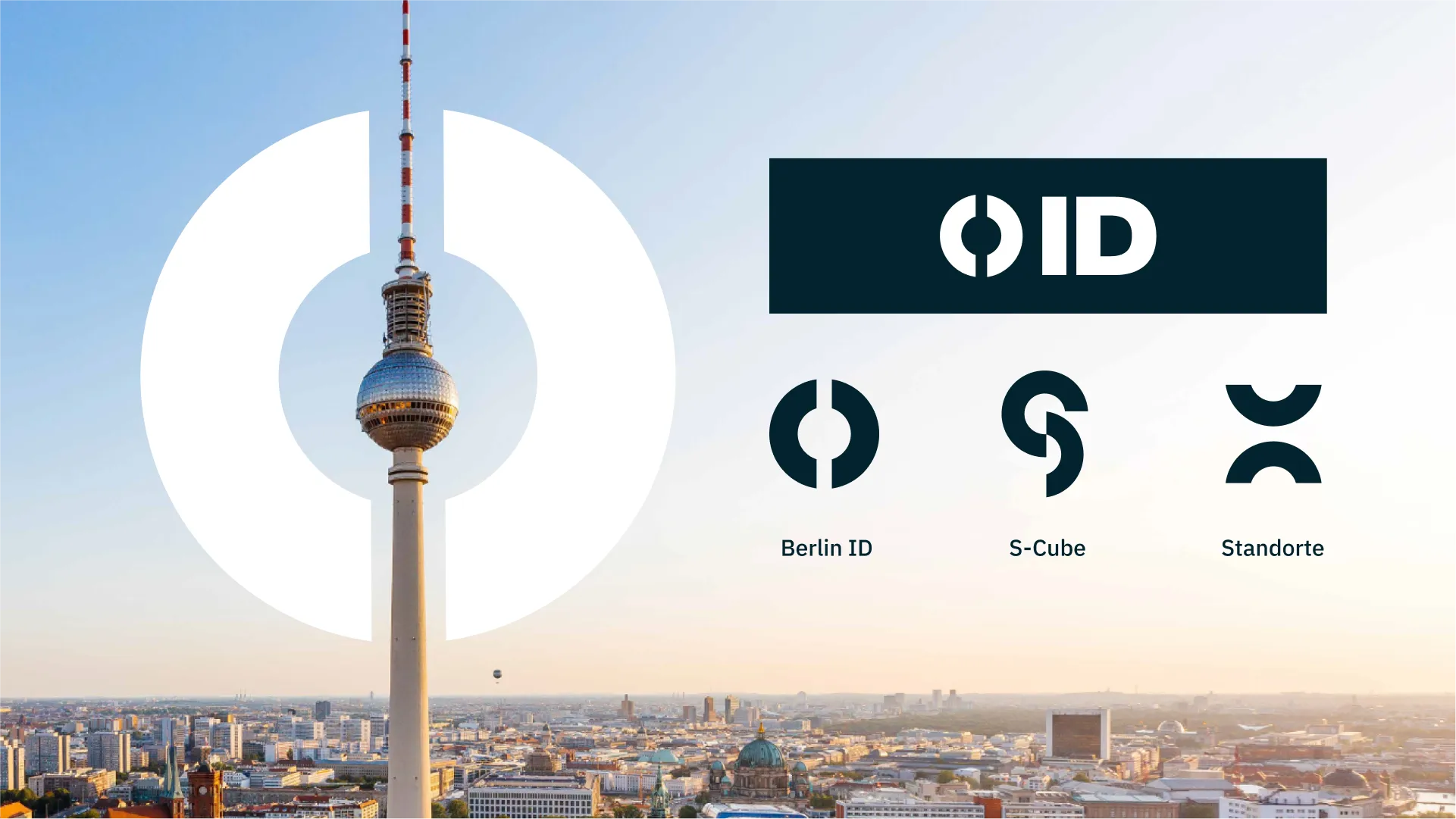
A new Berlin civic identity system with ‘ID’, S-Cube and location marks in dark blue and white.
4.1 A new identity that drops the red: it’s 50 years in the future and Berlin finally got a rebrand.
Research boards: a speculation map, interview clusters and feature matrices.
4.3 Weeks of interviews, speculation, and affinity clustering to design something that won’t exist for another 50 years.
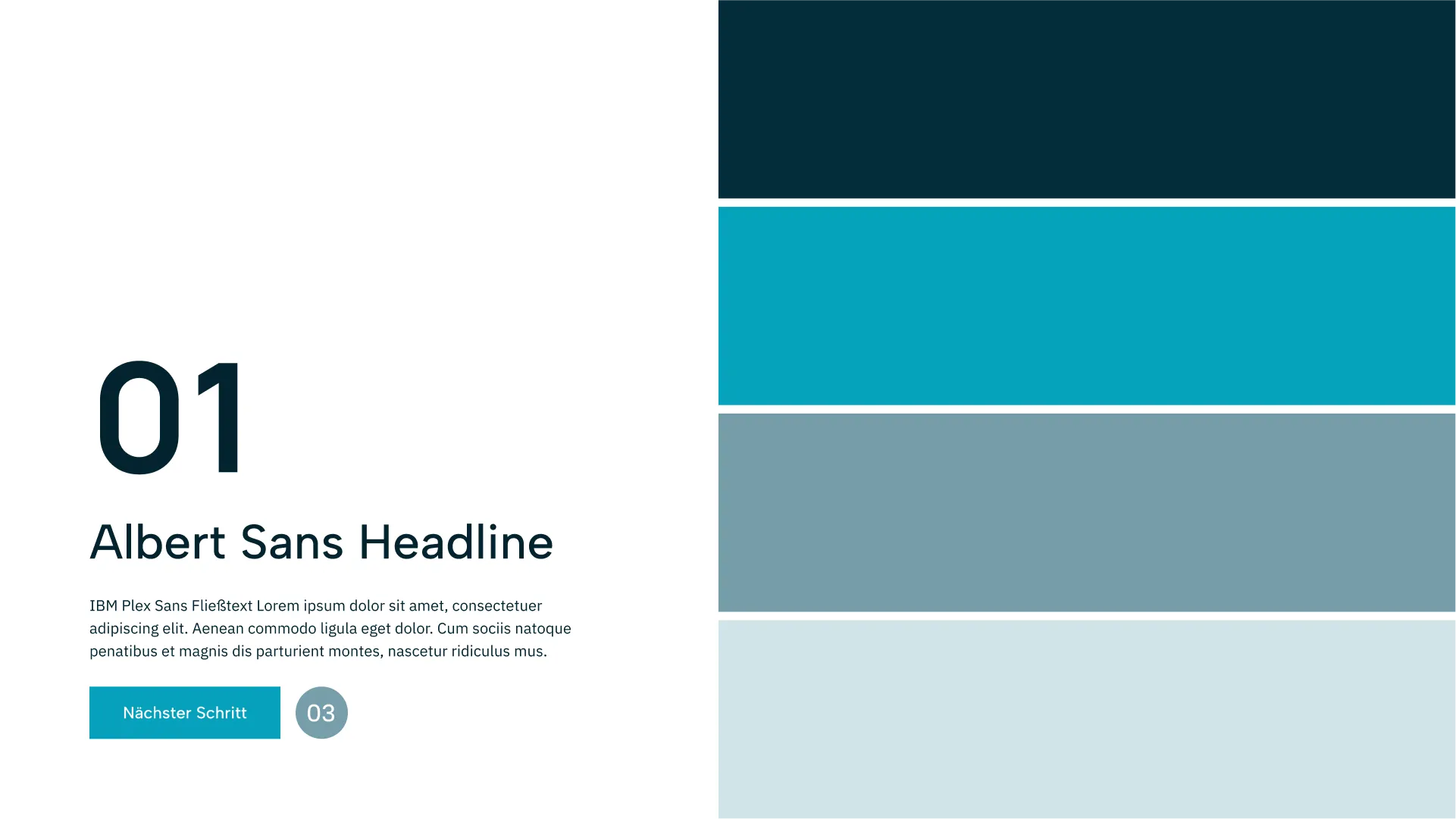
A type and colour specimen showing Albert Sans headlines and a four-step blue palette.
4.2 Albert Sans, IBM Plex Sans, and four shades of blue: the visual language for a bureaucracy that actually works.
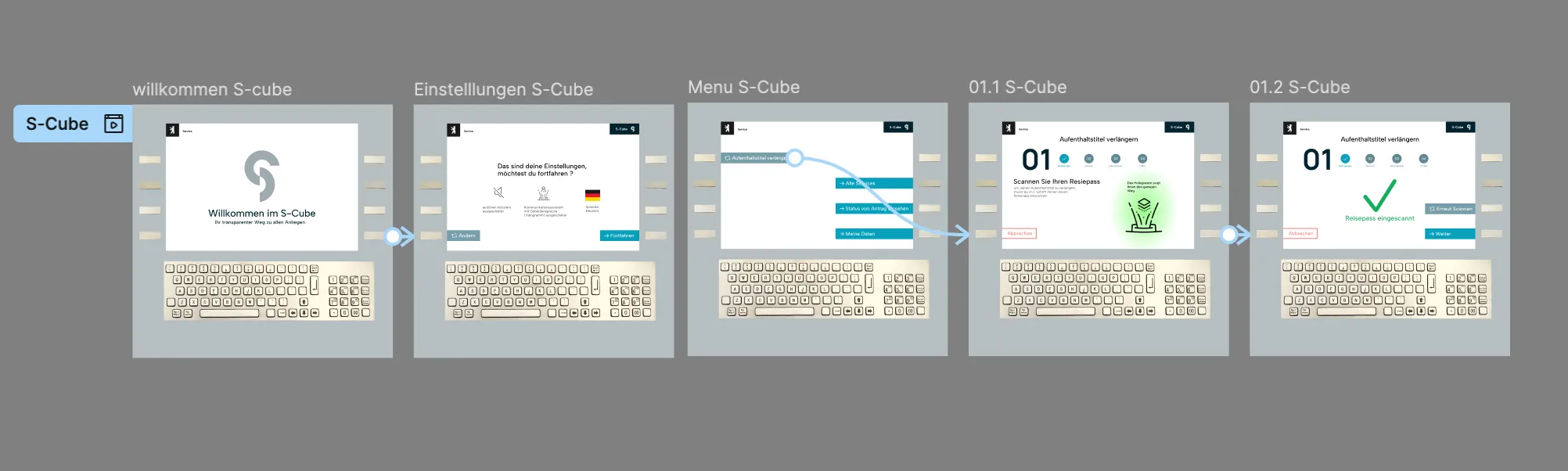
A horizontal flow of S-Cube kiosk screens from welcome to confirmation.
4.4 Transparent when open, frosted for privacy when closed, making a government service booth feel like it belongs on a street corner.
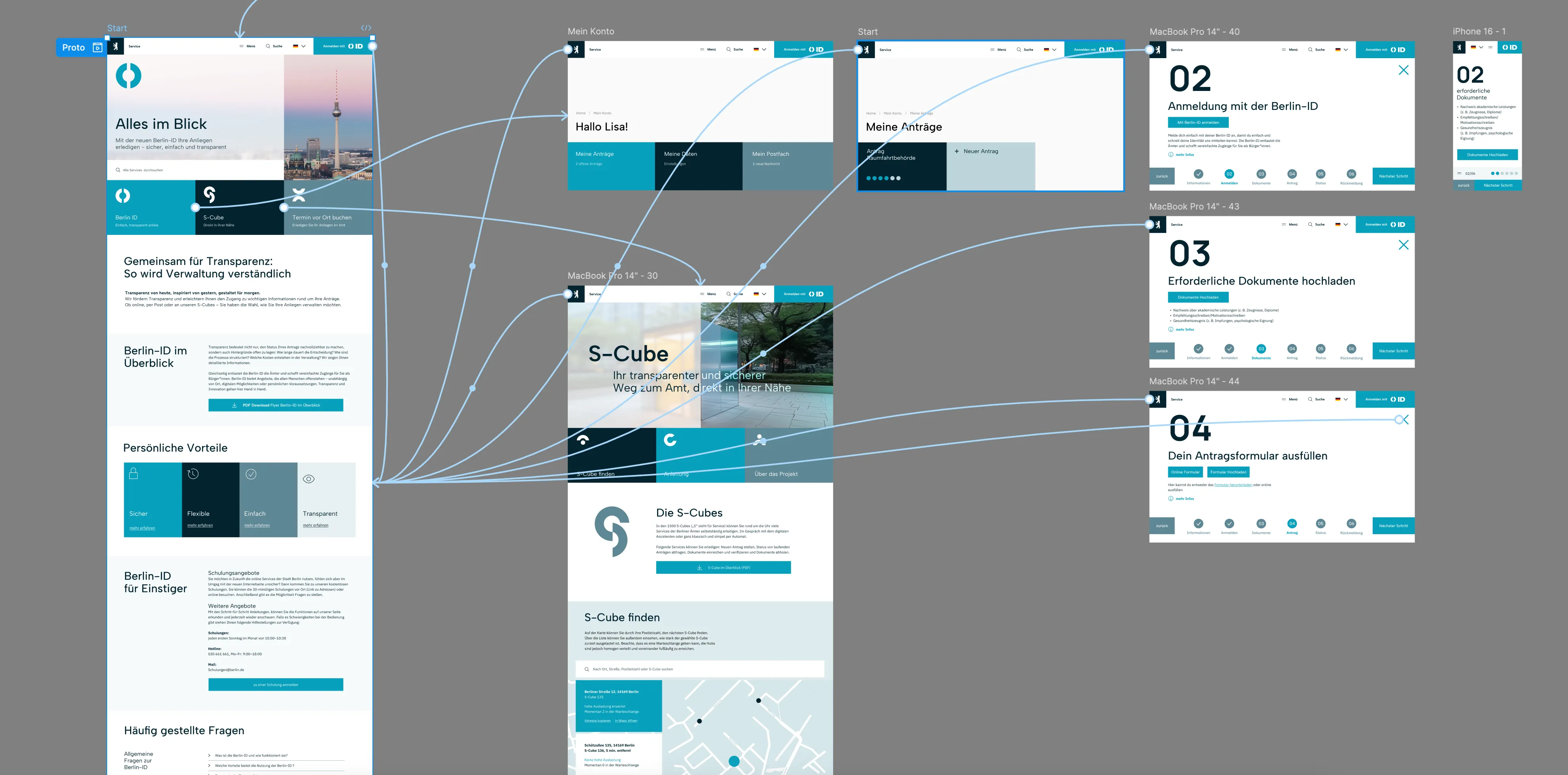
A Figma canvas of connected screens mapping the full guided service flow.
4.5 Guided step-by-step service flows for everyone who has given up on the current Bürgeramt website. The Figma prototype that made it to the presentation.

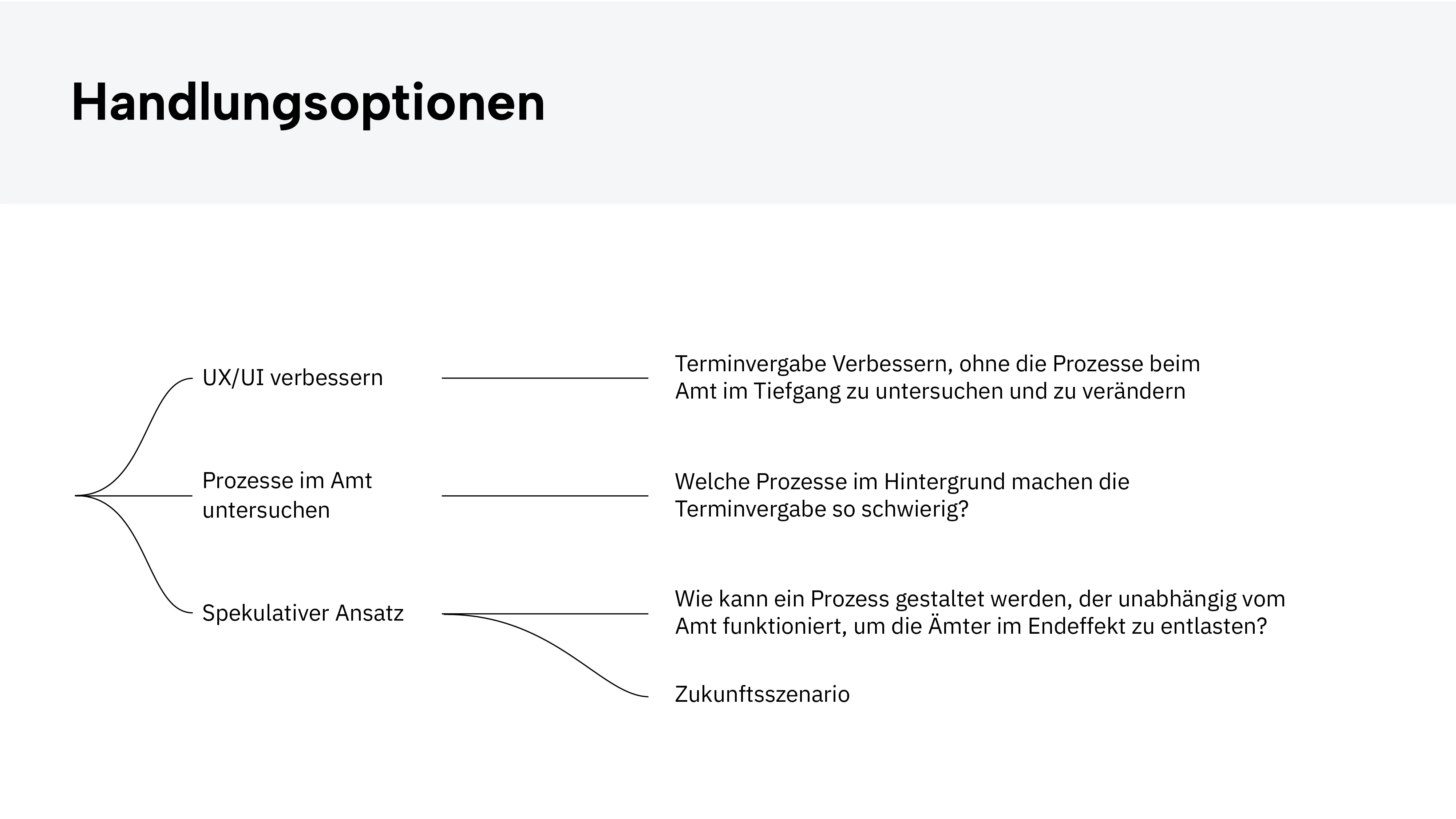
My contribution covered the website redesign and all user flows. The central challenge was navigating the pivot the team made mid-semester, from a straightforward UI improvement to a fully speculative future scenario — the course brief was literally “think utopically.”

This required rebuilding the information architecture and user flows around a three-channel system: website, S-Cube, and in-person office. The flows needed to serve radically different users: from digitally confident residents to elderly or non-German-speaking citizens — without excluding anyone.